Cascading Style Sheets (CSS) is what transforms plain HTML into visually engaging, user-friendly web experiences. It controls everything from layout structure and colors to animations and responsiveness. Without CSS, websites would look like simple text documents with no design or structure.
Table Of Content
- 1. Color and Background Styling
- 2. Typography and Text Control
- 3. Understanding the CSS Box Model
- 4. Display and Positioning Systems
- 5. Flexbox Layout System
- 6. CSS Grid for Complex Layouts
- 7. Responsive Design Techniques
- 8. Transitions, Transforms, and Animations
- 9. Managing Overflow and Visibility
- 10. Advanced CSS Properties You Should Explore
- Conclusion
- Related Reads
In today’s web development landscape, mastering CSS is not optional—it’s essential. Whether you’re building a personal portfolio, a business website, or a full-scale web application, understanding core CSS properties allows you to design interfaces that are both functional and beautiful.
This comprehensive guide dives deep into the most important CSS properties, explaining not just what they do, but how and why they are used in real-world development.
1. Color and Background Styling
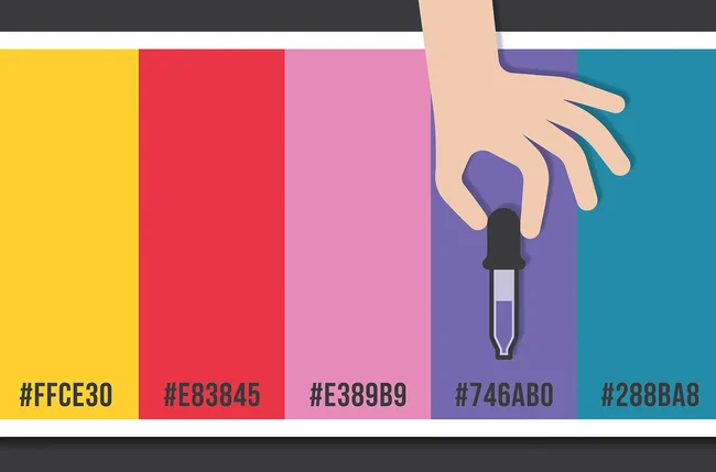
Colors are one of the first things users notice when they visit a website. CSS provides a rich set of properties to control color schemes and background designs.
The color property is used to define text color, while background-color sets the background of elements. Developers often use HEX, RGB, RGBA, or HSL values to define colors. For more advanced designs, gradients and images can be applied using background-image.
The background-size property ensures that background images scale properly across different screen sizes. Values like cover and contain help maintain visual consistency. Meanwhile, background-position allows precise control over where the image appears.
<span class="ͼ13">body</span> {
  color: #222;
  background: <span class="ͼv">linear-gradient</span>(<span class="ͼy">to</span> <span class="ͼy">right</span>, #6a11cb, #2575fc);
  background-size: <span class="ͼy">cover</span>;
}
Using color effectively improves readability, creates visual hierarchy, and enhances user engagement.
2. Typography and Text Control
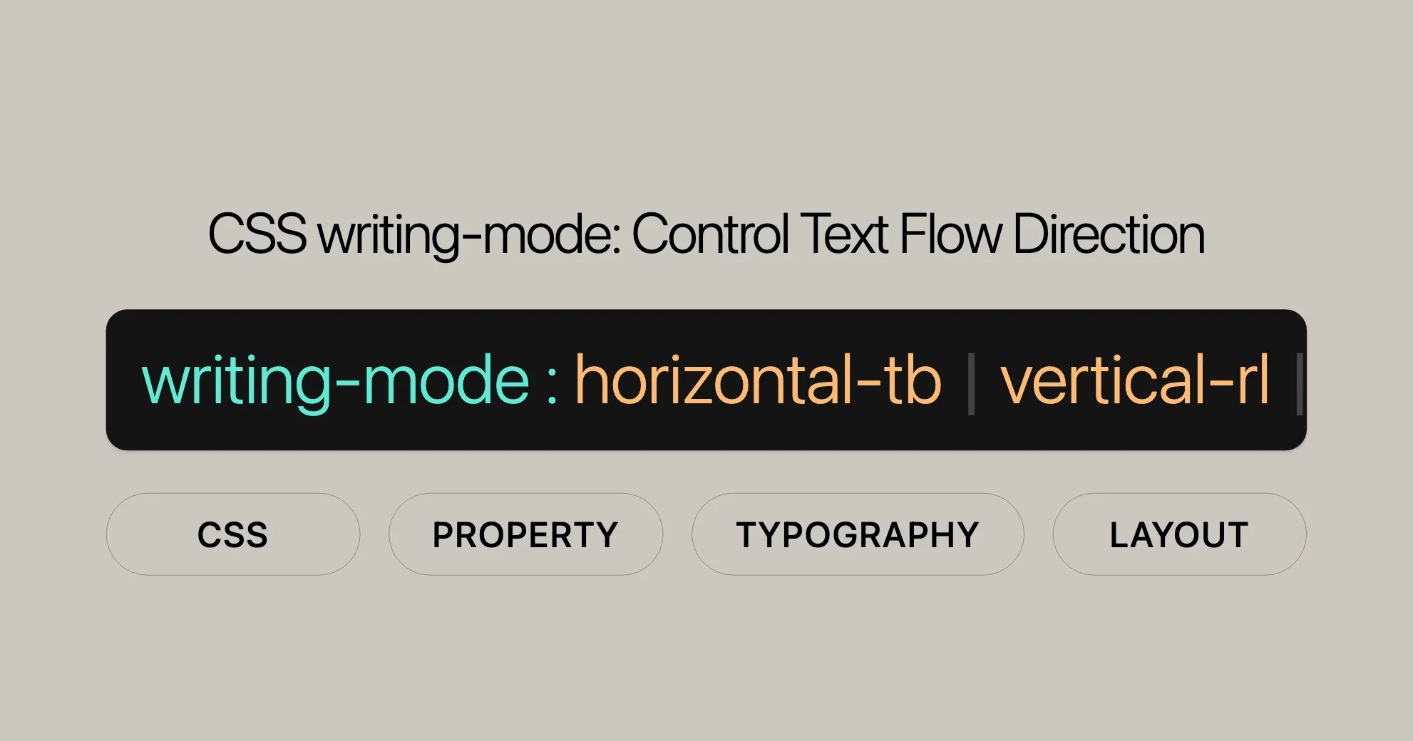
Typography is more than just choosing a font—it’s about creating a readable and visually appealing text experience.
The font-family property defines which typeface is used. Modern websites often use web-safe fonts or external font libraries. The font-size determines how large the text appears, and using relative units like em or rem improves scalability.
Spacing plays a crucial role in readability. The line-height property controls vertical spacing between lines, while letter-spacing adjusts the spacing between characters.
Text alignment and transformation are also important. Properties like text-align and text-transform help structure content visually.
<span class="ͼ13">p</span> {
  font-family: <span class="ͼz">'Roboto'</span>, <span class="ͼy">sans-serif</span>;
  font-size: <span class="ͼy">1</span><span class="ͼv">rem</span>;
  line-height: <span class="ͼy">1.6</span>;
  text-align: <span class="ͼy">justify</span>;
}
Well-designed typography ensures users can easily read and interact with your content.
3. Understanding the CSS Box Model
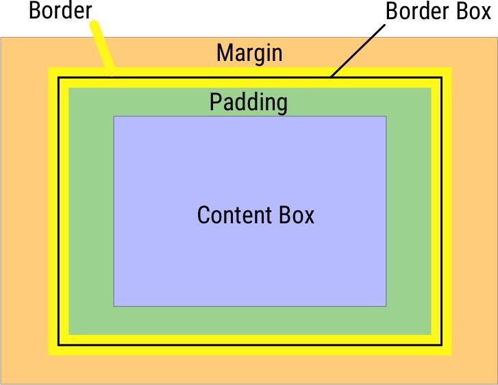
Every element in CSS is treated as a rectangular box. Understanding this concept is critical for layout design.
The box model consists of four parts: content, padding, border, and margin. The width and height define the size of the content area. Padding adds space inside the element, while margin creates space outside it.
Borders sit between padding and margin, and can be styled using properties like border-width, border-style, and border-color.
One important concept is box-sizing. Setting it to border-box ensures that padding and border are included within the defined width and height, making layout calculations easier.
.<span class="ͼ10">card</span> {
  width: <span class="ͼy">300</span><span class="ͼv">px</span>;
  padding: <span class="ͼy">20</span><span class="ͼv">px</span>;
  border: <span class="ͼy">1</span><span class="ͼv">px</span> <span class="ͼy">solid</span> #ccc;
  margin: <span class="ͼy">15</span><span class="ͼv">px</span>;
  box-sizing: <span class="ͼy">border-box</span>;
}
Mastering the box model allows you to build clean and consistent layouts.
4. Display and Positioning Systems
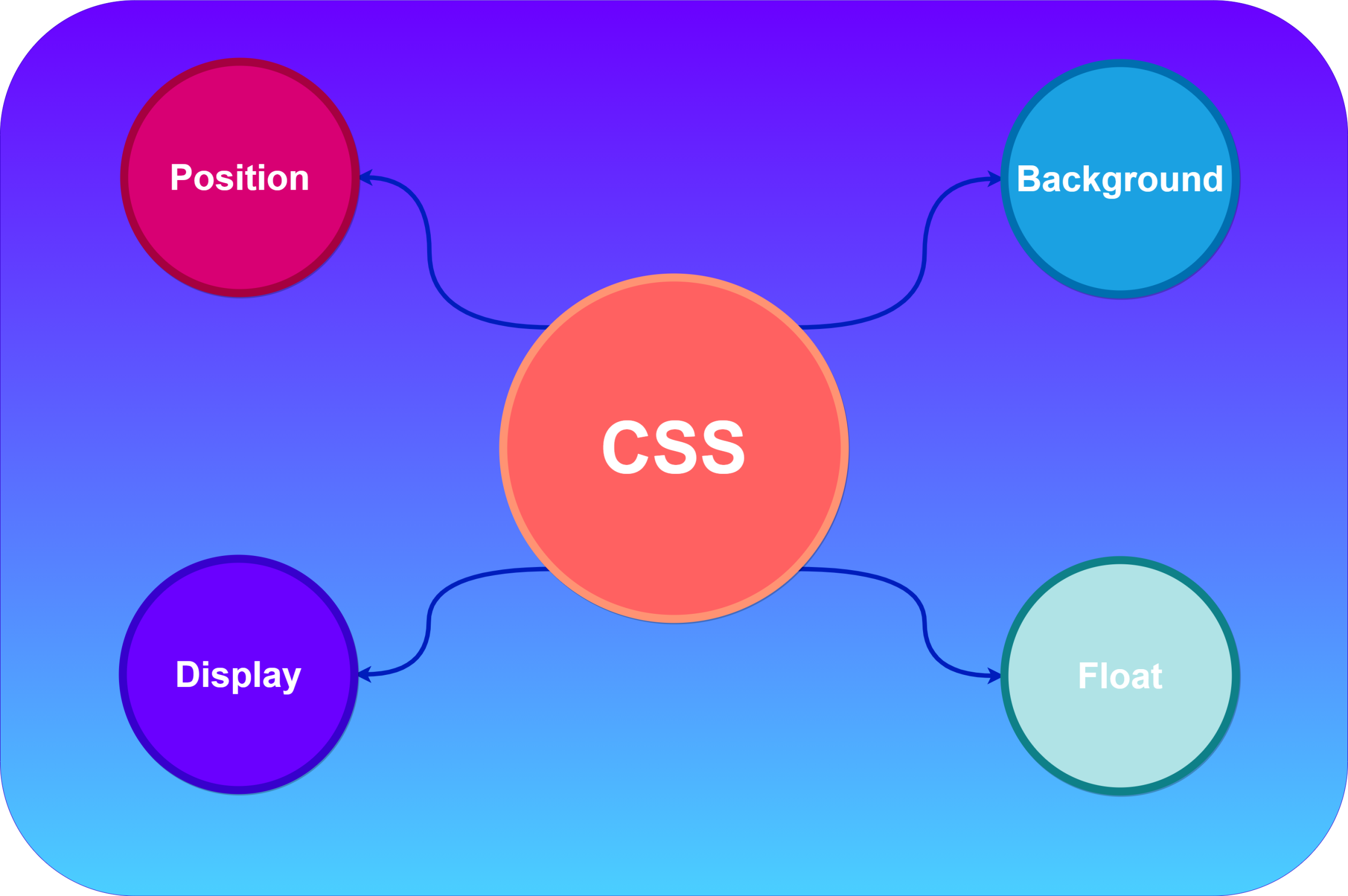
CSS provides powerful tools to control how elements are displayed and positioned.
The display property determines how an element behaves in the layout. Common values include block, inline, inline-block, flex, and grid. Each has its own use case.
Positioning is handled using the position property. Elements can be static, relative, absolute, fixed, or sticky. Combined with top, right, bottom, and left, you can place elements exactly where needed.
The z-index property controls the vertical stacking order, which is especially useful when elements overlap.
.<span class="ͼ10">box</span> {
  position: <span class="ͼy">absolute</span>;
  top: <span class="ͼy">50</span><span class="ͼv">px</span>;
  left: <span class="ͼy">100</span><span class="ͼv">px</span>;
  z-index: <span class="ͼy">10</span>;
}
Understanding positioning is key to creating advanced layouts and overlays.
5. Flexbox Layout System
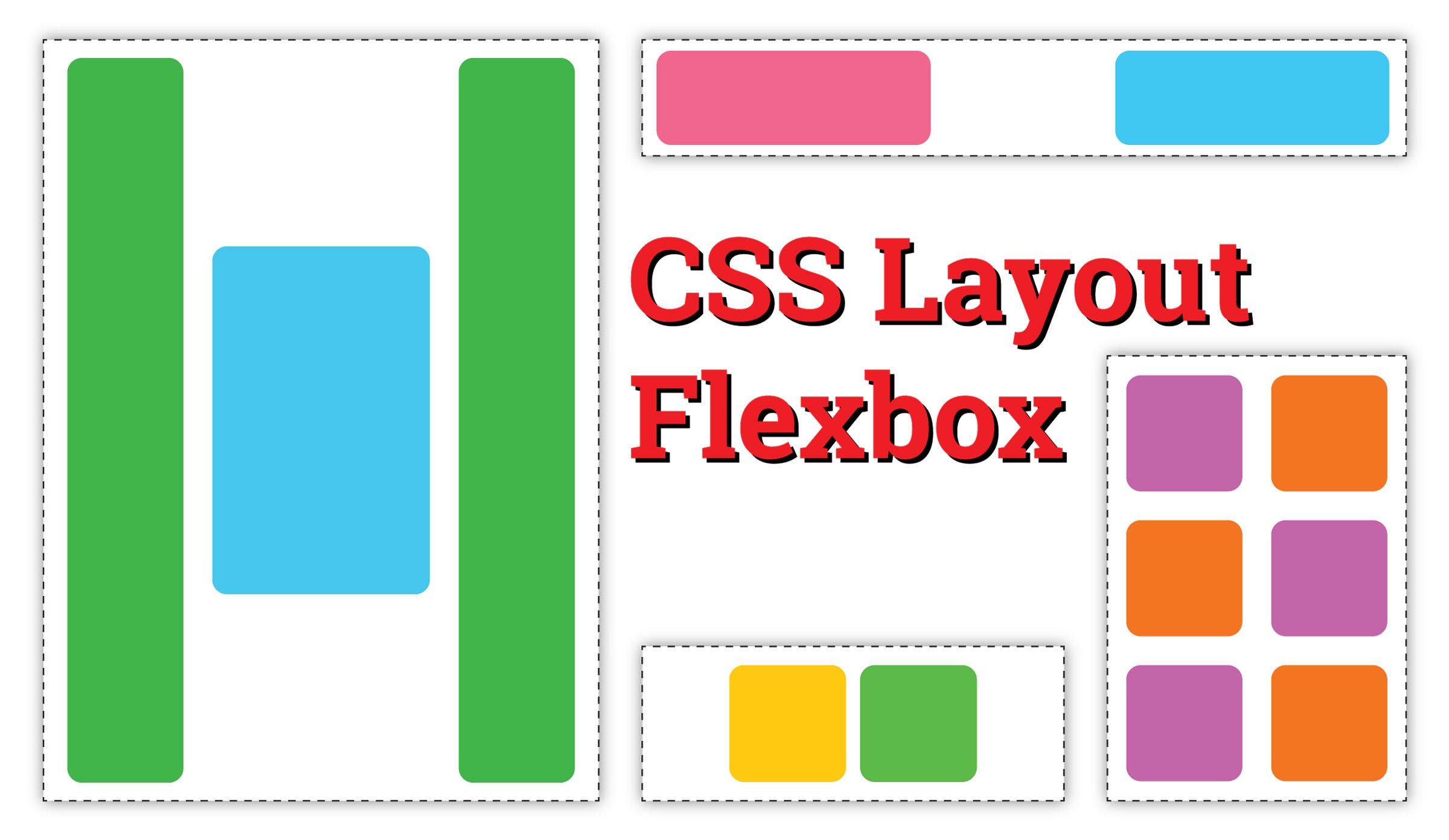
Flexbox is a one-dimensional layout system that simplifies alignment and spacing.
By setting display: flex, you turn a container into a flexible layout. The direction of items is controlled using flex-direction, while alignment is managed with justify-content (horizontal) and align-items (vertical).
Flexbox also supports wrapping using flex-wrap, allowing items to move to the next line when needed.
.<span class="ͼ10">navbar</span> {
  display: <span class="ͼy">flex</span>;
  justify-content: <span class="ͼy">space-between</span>;
  align-items: <span class="ͼy">center</span>;
}
Flexbox is ideal for navigation bars, card layouts, and responsive components.
6. CSS Grid for Complex Layouts
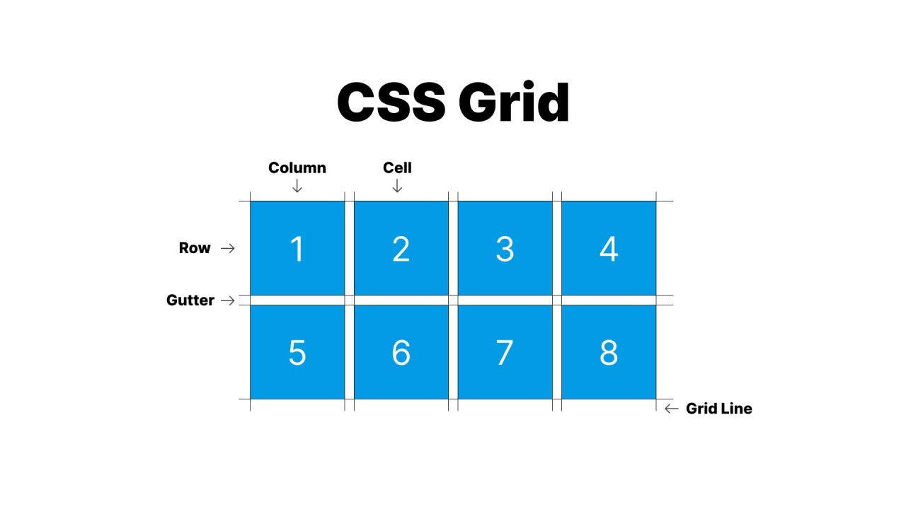
While Flexbox works in one dimension, CSS Grid handles two-dimensional layouts.
With display: grid, you can define rows and columns using grid-template-columns and grid-template-rows. The gap property adds spacing between grid items.
Grid also allows you to create named areas using grid-template-areas, making layouts more readable and maintainable.
.<span class="ͼ10">container</span> {
  display: <span class="ͼy">grid</span>;
  grid-template-columns: <span class="ͼv">repeat</span>(<span class="ͼy">3</span>, <span class="ͼy">1</span><span class="ͼv">fr</span>);
  gap: <span class="ͼy">15</span><span class="ͼv">px</span>;
}
Grid is perfect for building dashboards, landing pages, and full website layouts.
7. Responsive Design Techniques
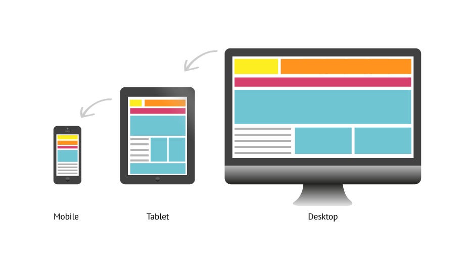
Modern websites must work seamlessly across devices of all sizes.
CSS achieves responsiveness using media queries. The @media rule applies styles based on screen size, resolution, or device characteristics.
Flexible units like %, vw, vh, em, and rem help create scalable layouts.
<span class="ͼv">@media</span> (max-width: <span class="ͼy">768</span><span class="ͼv">px</span>) {
  .<span class="ͼ10">container</span> {
    flex-direction: <span class="ͼy">column</span>;
  }
}
Responsive design ensures a consistent user experience across mobile, tablet, and desktop devices.
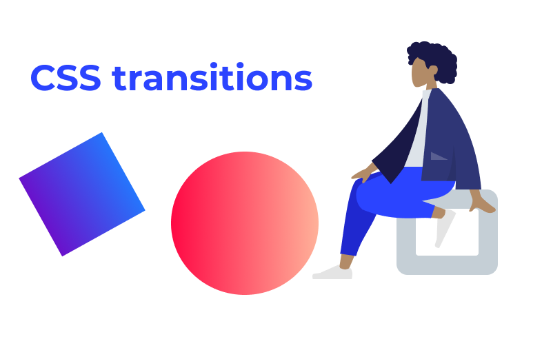
8. Transitions, Transforms, and Animations
Animations bring life to web interfaces and improve user interaction.
The transition property allows smooth changes between states, such as hover effects. The transform property enables scaling, rotating, and moving elements.
For more complex animations, CSS uses @keyframes along with the animation property.
.<span class="ͼ10">button</span> {
  transition: <span class="ͼy">transform</span> <span class="ͼy">0.3</span><span class="ͼv">s</span> <span class="ͼy">ease</span>;
}

.<span class="ͼ10">button</span>:<span class="ͼ10">hover</span> {
  transform: <span class="ͼv">scale</span>(<span class="ͼy">1.1</span>);
}
Animations should be subtle and purposeful to enhance user experience without distraction.
9. Managing Overflow and Visibility
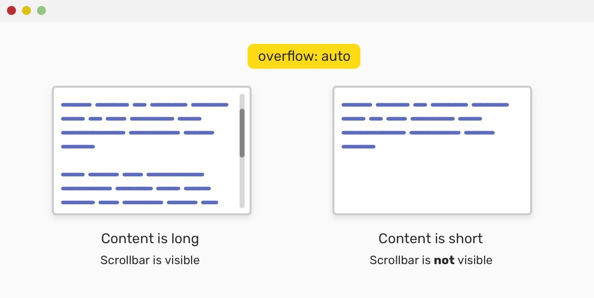
Handling content that exceeds its container is an important part of layout design.
The overflow property controls how extra content is handled. Options include hidden, scroll, and auto.
The visibility property determines whether an element is visible, while opacity controls transparency levels.
.<span class="ͼ10">content-box</span> {
  height: <span class="ͼy">150</span><span class="ͼv">px</span>;
  overflow: <span class="ͼy">auto</span>;
  opacity: <span class="ͼy">0.9</span>;
}
These properties help manage dynamic content and improve usability.
10. Advanced CSS Properties You Should Explore

Once you’re comfortable with the basics, exploring advanced CSS features can elevate your designs.
CSS variables (custom properties) allow you to reuse values across your stylesheet. The box-shadow property adds depth and visual hierarchy. Properties like border-radius create rounded corners, while clip-path enables creative shapes.
Modern CSS also includes effects like backdrop-filter, which is used for glassmorphism designs.
:<span class="ͼ10">root</span> {
  <span class="ͼ11">--primary-color</span>: #4CAF50;
}

.<span class="ͼ10">card</span> {
  background: <span class="ͼv">var</span>(<span class="ͼ11">--primary-color</span>);
  border-radius: <span class="ͼy">10</span><span class="ͼv">px</span>;
  box-shadow: <span class="ͼy">0</span> <span class="ͼy">4</span><span class="ͼv">px</span> <span class="ͼy">10</span><span class="ͼv">px</span> <span class="ͼv">rgba</span>(<span class="ͼy">0</span>,<span class="ͼy">0</span>,<span class="ͼy">0</span>,<span class="ͼy">0.2</span>);
}
These advanced techniques help create modern, visually rich interfaces.
Conclusion
CSS is a powerful styling language that goes far beyond simple colors and fonts. By mastering essential properties such as layout systems, typography, responsiveness, and animations, you gain the ability to build professional, high-quality websites.
The journey to mastering CSS requires practice and experimentation. Start with these core properties, build projects, and gradually explore advanced techniques. Over time, you’ll develop the skills needed to create responsive, accessible, and visually stunning web applications.
Want to Learn More About CSS, Kaashiv Infotech Offers, Front End Development Course, Full Stack Developer Course & More, Visit Our Website www.kaashivinfotech.com.
Related Reads:

